We have re-analysed all the Schlumberger measurement data files as provided by the DINO loket (see this page). Why? It seems that the analysis of the measurement data has been performed some time ago, using some limiting assumptions. And because we have found some inconsistencies that we wanted to fix, where possible. Let us show you what we did.
Which geo-electric data is provided by DINO loket?
On the website of DINO, data from Wenner (1.151) and Schlumberger (13.290) measurements can be found. We have downloaded all files and analysed all Schlumberger measurements (Wenner may follow at a later point). Some statistics are given below.
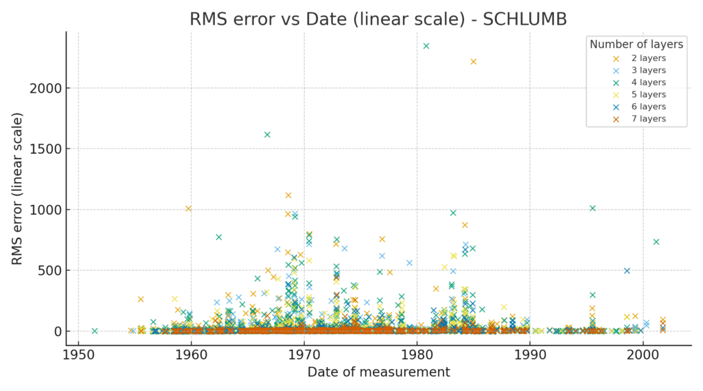
The first figure shows when in thime the measurements have been performed. The figure also includes an indication of the inaccuracy of our analysis. This items are displayed in different colours, where every marker colour represents a different amount of layers in the 1D soil model. The re-analysis is performed with an automized tool, based on this one.

How many layers does the original interpretation of the models have?
The following figure shows the distribution of the original layer-interpreation, as provided by DINO. As you see, the interpretation goes up to 12 layers. Also, in more than 10% of the cases no interpretation was done before.
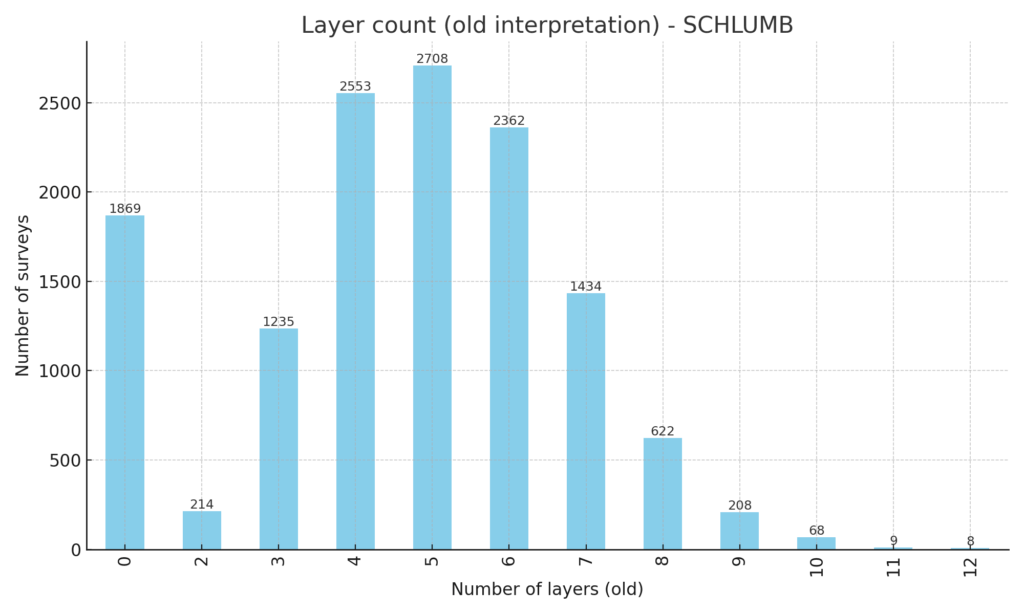
We have taken a look at the data and were able to reduce the amount of layers for many measurements, and produce a model for the +10% that had no interpretation before.
What does the new interpretation of the measurement data look like?
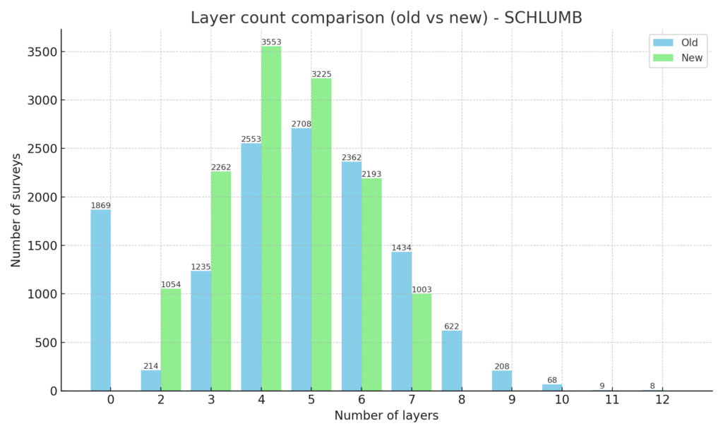
The following figures show and compare some data. Figure 4 presents the distribution of layers, the initial amount of layers versus the amount of layers in the re-analysis.
But which soil model went where? That is displayed in figure 5. On the left you can see that the models that initially had no interpretation (0 layers on the X-axis) now mostly consist out of 4, 5 or 6 layers. A smaller amount has 3 or 7 layers and only a few of them are double layer models. The purple circles along the diagonal line show that the amount has not changed, everything on the right of the diagonal line has a reduced number of layers. A few of them are on the left side of the line, and therefore have additional layers.
